
What Makes an Exemplary NDIS Website? The TARS Case Study
An NDIS website needs to do far more than look professional.
It should be accessible, easy to understand, fast on mobile devices and clear about what the provider offers. It should also give participants, families and referrers a safe and straightforward way to take the next step.
When Providerflow built and optimized the website and digital systems for Triple A Recovery Services, our goal was not simply to create an attractive website.
We created a connected participant journey—from the first website visit through enquiry, suitability checks, intake, consultation and onboarding.
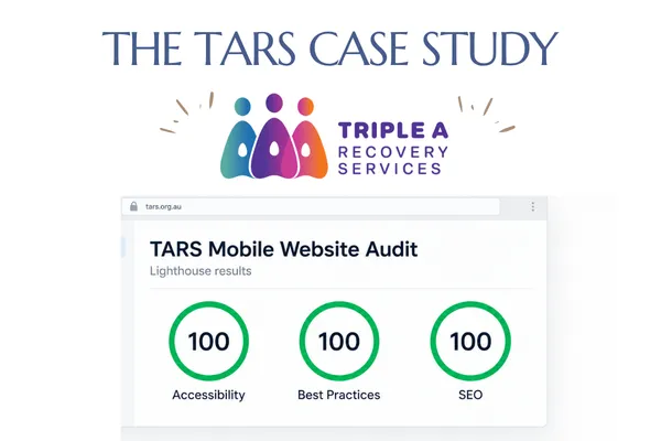
The result was a website that achieved perfect Lighthouse scores for Accessibility, Best Practices and SEO, alongside major improvements in mobile performance and layout stability.
The starting point
Triple A Recovery Services provides Support Coordination and Psychosocial Recovery Coaching across Melbourne.
Its website needed to communicate a calm, highly accountable approach to supporting people with psychosocial disability and complex circumstances. It also needed to work effectively for participants, families, carers and professional referrers.
Our initial technical assessment identified several areas for improvement:
Mobile Performance scored 51.
Accessibility scored 96.
SEO scored 92.
The mobile page shifted significantly while loading.
Images were larger than necessary.
Some links were not descriptive enough.
Colour contrast did not meet the required accessibility standard.
Important resources were taking too long to appear on mobile devices.
These are not merely technical problems. They directly affect whether someone can understand a service, navigate the website and complete an enquiry.
Building accessibility into the experience
Accessibility is particularly important in the NDIS community.
Visitors may be managing visual, cognitive, psychosocial or motor accessibility needs. They may also be overwhelmed, unfamiliar with the NDIS or trying to find support during a difficult period.
We improved colour contrast, link descriptions, image information, headings and page structure. We also stabilized the page so content no longer moved unexpectedly while someone was trying to read or select a button.
The website’s automated Accessibility score increased from 96 to 100.
A Lighthouse score is only one part of accessibility, but it provides an important technical foundation. We also design forms, navigation and content around clarity, predictable behaviour and plain language.
Creating a faster, more stable mobile experience
The original mobile website had a Cumulative Layout Shift score of 0.485. This meant parts of the page moved considerably as images, fonts and other elements loaded.
We identified the elements causing the movement and reserved the correct amount of space for them before they appeared.
The verified mobile layout-shift result was reduced to zero.
We also optimized the homepage images so visitors were not downloading unnecessarily large files.
For example, some small service icons were being delivered at up to 1200 pixels even though they appeared at approximately 150 pixels on the page. We replaced them with appropriately sized WebP versions and reduced the delivery size of larger photographs.
The result was a more stable and efficient website without reducing image quality or changing the visual design.
Helping the most important content appear sooner
The first few seconds of a website visit matter.
Visitors should not have to wait for the heading, introductory message or main enquiry button to appear. This is particularly important on mobile devices and slower connections.
We identified the homepage section that browsers recognized as the main visible content and optimized how its image, fonts and text were delivered.
Different screen sizes now receive appropriately sized hero images, and the browser is told which important resources to prioritize.
This helps participants and referrers see the essential information and next step sooner.
Strengthening search visibility
The original SEO score was 92.
We corrected links that did not clearly explain their purpose, reviewed the page structure and checked how the homepage was connected to the public domain.
We also resolved a GoHighLevel-specific URL issue. GHL uses an internal website path while the domain settings control the public homepage. Understanding this distinction allowed us to preserve the correct platform configuration while ensuring visitors and search engines reached the intended page.
The final Lighthouse SEO score was 100.
Good NDIS SEO is not about forcing keywords into generic content. It means clearly explaining:
what services the organisation provides;
who those services are designed for;
where support is available;
how someone can access the service; and
what the visitor should do next.
Protecting functionality while improving performance
It is possible to make a website appear faster in a testing tool by removing analytics, chat tools and other useful functions.
That is not always a good business decision.
The TARS website uses Google Analytics, a website chatbot, enquiry pathways and GoHighLevel automation. These systems help TARS understand how people find the service, respond to enquiries and manage the participant journey.
We audited these systems carefully and retained the tools that delivered real operational value.
Performance testing should never be separated from the purpose of the website. A perfect laboratory score is not useful if the website no longer collects enquiries, records essential data or supports participants properly.
Our approach is to pursue the strongest practical performance result while protecting accessibility, reliability and business functionality.
More than a website
The most important part of the TARS project sits behind the visible pages.
The website is connected to a structured enquiry and intake system that can:
distinguish between participants, families, referrers and other enquiries;
identify whether someone is seeking Support Coordination or Recovery Coaching;
check the participant’s location and NDIS funding;
collect the information needed to assess suitability;
direct existing participants to a human response;
apply safety rules where someone may be in crisis;
prevent inappropriate automated booking;
send the correct intake information;
provide email and SMS follow-up;
move suitable enquiries through eligibility review;
provide consultation booking at the appropriate stage; and
connect the enquiry to the provider’s CRM and onboarding process.
This means the website does not simply generate more enquiries. It helps the organisation manage enquiries consistently, safely and with less administrative pressure.
Understanding NDIS-specific website requirements
A strong NDIS website needs to account for areas that general website templates often overlook.
These include:
accessible forms and navigation;
clear complaints and feedback pathways;
accurate privacy information;
transparent NDIS registration details;
truthful descriptions of services and service areas;
appropriate participant and referrer pathways;
careful language around outcomes;
visible trust and credibility signals;
independent escalation information; and
safe handling of sensitive enquiries.
Providerflow considers these requirements when designing the website structure and the systems connected to it.
We do not treat accessibility, compliance, marketing and automation as separate projects. They are parts of the same participant experience.
What the results mean
Following optimization, the TARS website achieved:
100 for Accessibility;
100 for Best Practices;
100 for SEO;
zero mobile layout shift in the verified test;
substantially improved mobile performance;
more efficient image delivery; and
a connected enquiry, intake and onboarding pathway.
View the verified TARS Lighthouse report or visit the TARS website.
Performance scores can vary between Lighthouse tests, particularly on platforms such as GoHighLevel that load essential framework code and third-party systems. We therefore assess the underlying performance measurements as well as the headline score.
Our aim is always to achieve 100 across the board where the platform allows it—without damaging the systems the organisation needs to operate.
What Providerflow can do for your organisation
Providerflow builds websites and digital systems specifically for the NDIS community.
We can help your organisation:
improve Accessibility, SEO, Best Practices and mobile Performance scores;
create clearer participant and referrer pathways;
improve website accessibility and ease of use;
explain services and locations more effectively;
strengthen trust and professional credibility;
create structured enquiry and intake processes;
introduce suitability and safety checks;
automate follow-up without losing the human element;
connect consultation booking to the correct intake stage; and
integrate the website with your CRM and operational workflows.
The result is not just a better website.
It is a clearer, safer and more consistent pathway for the people trying to access your services—and a more manageable system for the team responsible for supporting them.
If you would like to understand what may be limiting your current website, Providerflow can review its accessibility, performance, search visibility, participant journey and connected systems.
Talk to Providerflow about your NDIS website and enquiry process
